How to Read a Volcano Plot: Fold Change, P-Values and FDR Explained
A beginner's guide to the most misread figure in genomics: what each axis means, why adjusted p-values matter, six ways the plot misleads, and how to draw one yourself in R or Python. Every figure uses real, public data.

- #volcano plot
- #RNA-seq
- #differential expression
- #p-value
- #false discovery rate
- #log2 fold change
- #DESeq2
- #bioinformatics
- #statistics
- #data visualisation
One figure turns up in almost every gene expression paper. It has a dense grey mound at the bottom, two plumes of coloured dots rising from it, and a few gene names pinned to the highest points. In lab meeting, everyone nods at it. Far fewer people could say what a dot halfway up the left plume means, or why the most dramatic-looking dots are often the ones to trust least.
That figure is a volcano plot. It packs around twenty thousand statistical tests into a single picture, which makes it one of the most efficient figures in biology and one of the easiest to misread.
This guide teaches you to read one properly. By the end you will be able to:
- say what each axis measures, and turn its numbers back into plain language
- tell a dot that deserves belief from one that only looks impressive
- explain an adjusted p-value and a false discovery rate to a labmate
- spot the common ways a volcano plot flatters its data
- draw one yourself from a public dataset, in Python or in R
You need no statistics beyond knowing what an average is, and no code until the last section. The examples use gene expression from RNA sequencing, but the same reading applies to proteomics, metabolomics, CRISPR screens and any other experiment that measures thousands of things in two conditions.
What a volcano plot shows
A volcano plot answers two questions about every gene at once: how much did it change, and how sure can we be that the change is real?
Picture an experiment with two groups of samples, treated and untreated. For each gene you measure its activity in both groups and run a statistical test. That leaves you with two numbers per gene:
- the fold change: how many times higher or lower the gene is in the treated group
- the p-value: how surprising that difference would be if the treatment did nothing
The plot draws one dot per gene. The fold change decides how far left or right the dot sits. The p-value decides how high it sits.
Every figure in this article comes from one public experiment. Researchers grew airway smooth muscle cells from four donors and treated them with dexamethasone, a steroid used in asthma, for 18 hours. An untreated dish from the same donor served as each control. We downloaded the read counts and ran the analysis ourselves, so you can reproduce every number here in the last section.
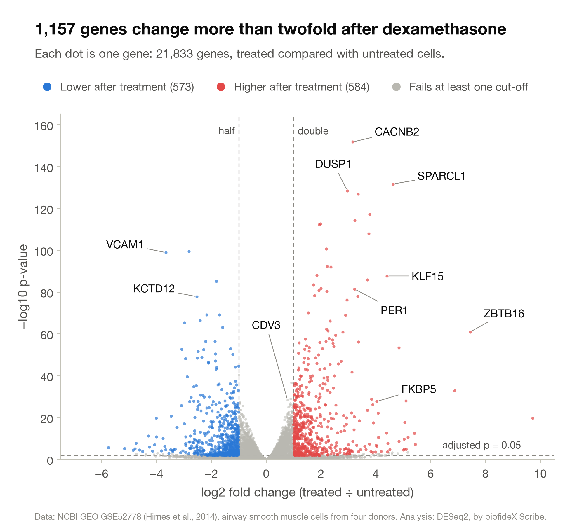
Three things are worth noticing before any detail:
- Most dots are grey and piled at the bottom centre. Most genes did not respond to the drug in any way this experiment could detect.
- The coloured dots form two plumes. Red, on the right, is higher after treatment. Blue, on the left, is lower.
- Height means evidence. The higher a dot sits, the harder it is to explain its change as chance.
The named genes at the top right include PER1, DUSP1, KLF15 and FKBP5. All four are well-known steroid-response genes, which is a good sign that the analysis has found real biology. Checking for a gene you already expect is the fastest sanity test of any volcano plot.
The horizontal axis: how much did it change?
The horizontal axis shows the size and direction of each gene's change, written as a log2 fold change.
Start with the plain fold change. If a gene averages 100 reads in untreated cells and 400 in treated cells, its fold change is 400 ÷ 100 = 4. If it falls from 100 to 25, its fold change is 0.25.
Plain fold changes are lopsided. Increases get the whole range from 1 upward, while every decrease is squeezed between 0 and 1. On that scale a fourfold rise would sit far from the centre and a fourfold fall would barely move.
Taking the logarithm in base 2 fixes this. Log2 asks one question: how many times was the value doubled? A fourfold rise is two doublings, so it scores +2. A fourfold fall is two halvings, so it scores −2. Rises and falls of the same size now sit the same distance from zero, on opposite sides.
log2 fold change   plain fold change   in words
      0                   1            no change
    ±0.58                 1.5          half as much again, or a third less
    ±1                    2            doubled, or halved
    ±1.58                 3            tripled, or cut to a third
    ±2                    4            4 times higher or lower
    ±3                    8            8 times
    ±3.32                10            10 times
    ±5                   32            32 times
   ±10                1,024            about a thousand times
To convert any value yourself, raise 2 to that power. A log2 fold change of 2.5 is 22.5, which is about 5.7-fold.
Now the labelled genes in Figure 1 can be read in plain language:
- ZBTB16 sits at 7.4, so it is about 173 times higher after treatment.
- SPARCL1 sits at 4.6, about 25 times higher.
- VCAM1 sits at −3.7, about 13 times lower.
- CDV3 sits at 0.78, about 1.7 times higher.
Check the direction before anything else
A positive value means "higher in the group named first", and the analyst chooses which group that is. Figure 1 divides treated by untreated, so right means higher after treatment. Drawn the other way round, the same data would appear mirror-flipped and every "up" gene would become a "down" gene.
The axis label or the caption should state the comparison. If neither does, the plot cannot be interpreted.
What this axis leaves out
A log2 fold change says nothing about how abundant a gene is. A gene that goes from 2 reads to 16 and a gene that goes from 2,000 to 16,000 both sit at +3. The first is a handful of molecules; the second is a measurement you can lean on. This matters a great deal further down.
The vertical axis: how strong is the evidence?
The vertical axis shows each gene's p-value, transformed so that stronger evidence sits higher.
What a p-value says
For each gene, the statistical test starts from a sceptical position: the treatment does nothing to this gene, and any difference between the groups is ordinary variation between samples. The p-value is the probability of seeing a difference at least as large as the one observed, if that sceptical position were true.
A small p-value therefore means the data would be surprising if nothing were going on. It helps to be exact about what it does not mean:
- It is not the probability that the result is a fluke. A p-value of 0.01 does not mean a 1% chance that the gene is unchanged.
- It is not the size of the change. A small change measured very consistently can earn a tiny p-value.
- It is not a measure of biological importance.
Why the axis uses −log10
The interesting p-values are tiny: 0.001, 0.0000001 and smaller. On a plain axis from 0 to 1 they would all be crushed against one edge. Taking the negative log10 spreads them out and turns them upside down, so the smallest p-values sit highest.
p-value        −log10(p-value)
0.05                1.3
0.01                2
0.001               3
0.000001            6
1e-10              10
1e-50              50
A handy way to read it: the height is the number of decimal places the p-value needs. A dot at height 3 has a p-value of 0.001. Each step up of one unit makes the p-value ten times smaller.
Do not read the great heights literally
In Figure 1, CACNB2 sits at about 152. Taken literally, that is a p-value that needs about 152 decimal places. No experiment on cells from four donors supports that degree of certainty. The number comes out of a statistical model, and models are least reliable in their extreme tails.
Above a height of 10 or so, read the axis as a ranking and not as a measurement. "Very strong evidence" is all that a dot at 50 or at 150 can honestly claim.
We can show how soft these numbers are. We ran the same read counts through two implementations of the same method: DESeq2 in R, and PyDESeq2, its port to Python. The two agree almost perfectly on fold changes and share 1,149 of their hits. Yet for one gene, CDV3, R reports a p-value of 5 × 10⁻²⁹ and Python reports exactly zero. The data are identical. Only a detail in how each tool estimates that gene's variability differs.
A p-value of zero cannot be drawn at all, because zero has no logarithm. Some plotting tools pin such genes to the top edge, some to an arbitrary ceiling, and some silently drop them.
A map of the plot: five regions
With both axes in hand, a dot's position tells you what kind of result it is. Figure 2 enlarges the lowest part of Figure 1 and marks five regions.
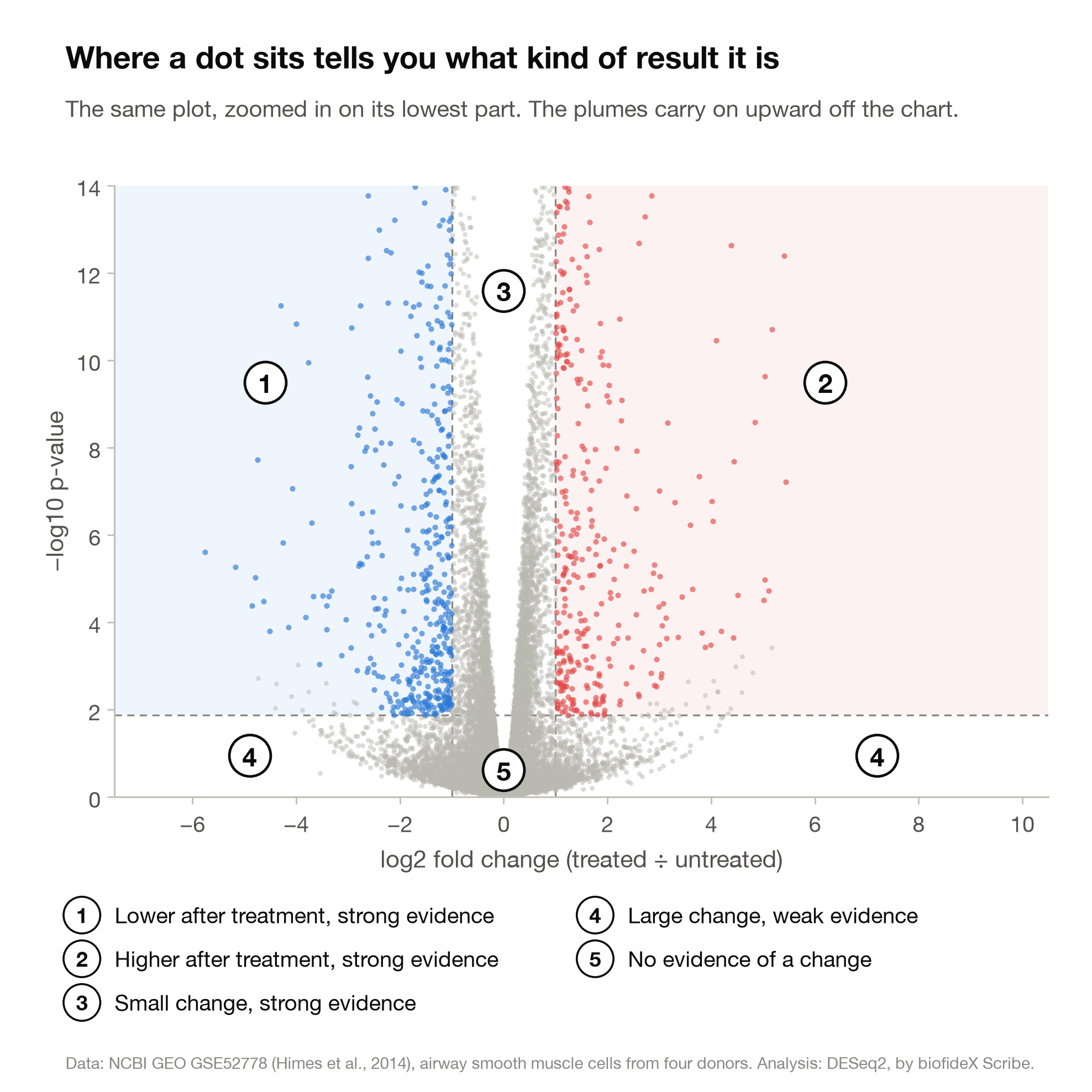
- Upper left: lower after treatment, strong evidence. VCAM1 belongs here. Its read counts fell from roughly 900 to 1,500 down to 60 to 170, in the cells of all four donors.
- Upper right: higher after treatment, strong evidence. Regions 1 and 2 are what the plot is built to find: large changes that are well supported.
- Upper centre: small change, strong evidence. These genes moved modestly but very consistently. They tend to be abundant genes, which are measured precisely.
- Bottom corners: large change, weak evidence. A dramatic fold change that the data cannot back up.
- Bottom centre: no evidence of a change. This is where most genes live.
A few grey dots sit just above the line in the outer columns. They are very low-count genes that the software declined to judge, and we come back to them below.
A small, steady change can outrank a dramatic one
CDV3, the labelled grey dot in the middle of Figure 1, belongs to region 3. It rises only 1.7-fold, so it misses the twofold cut-off and stays grey. But it rises almost identically in the cells of all four donors: 1.66, 1.76, 1.72 and 1.73 times.
A significance test rewards consistency. CDV3 sits at a height of 28, above 994 of the 1,157 coloured genes, every one of which changed more than it did. Whether a 1.7-fold change matters to the cell is a question for biology, and the statistics cannot answer it.
"No evidence of a change" is not "no change"
A gene in region 5 either did not respond, or responded too weakly or too noisily for this experiment to tell. Cells from four donors can reveal large effects and will miss subtle ones. A grey dot never justifies the sentence "gene X was unaffected".
The coloured dots are a small minority
Here is how the 21,833 genes in this dataset divide up:
region                                    genes    share
5        no evidence of a change         15,446    70.7%
3        small change, strong evidence    3,647    16.7%
4        large change, weak evidence      1,583     7.3%
1 and 2  large change, strong evidence    1,157     5.3%
The eye goes to the red and blue plumes, yet they hold about one gene in twenty. Region 3 holds more than three times as many. Most genes that respond to this drug respond by less than twofold, and the colouring hides them in grey.
Why it looks like a volcano
The two axes are linked. To earn a small p-value, a gene's change has to be large compared with its noise. A gene whose change is close to zero cannot climb, so the centre stays low. The further out a dot sits, the higher it is able to go. That carves the empty notch in the middle and throws the two plumes up and out.
The threshold lines, and who chose them
The dashed lines are cut-offs chosen by the analyst, and moving them changes how many genes count as hits.
Most volcano plots carry three lines:
- Two vertical lines set a minimum fold change. The usual choice is ±1 on the log2 axis, a twofold change. Some analyses use ±0.58 (1.5-fold) or ±2 (fourfold).
- One horizontal line sets the significance cut-off, usually an adjusted p-value of 0.05.
A gene beyond both lines is coloured and called a hit, or a differentially expressed gene (DEG).
Neither cut-off is a law of nature. The 0.05 convention dates from the 1920s, and twofold is simply a round number. Here is what different choices do to our dataset:
                      fold change of at least
adjusted p-value      1.5x       2x       4x
below 0.01           2,006      998      274
below 0.05           2,346    1,157      294
below 0.10           2,543    1,254      303
The same experiment yields anywhere from 274 to 2,543 hits. In this dataset, moving the fold-change line changes the count far more than moving the p-value line does.
So when a paper reports "1,157 differentially expressed genes", that number is a joint product of the biology and the cut-offs. Hit counts from two studies can be compared only when their cut-offs and methods match.
Three habits for reading the lines
- Treat genes near a line as borderline. A gene at 1.05 is coloured and a gene at 0.95 is grey, though the two results are practically the same. The line turns a smooth range into a yes or a no.
- Be curious about unusual cut-offs. A fold-change line at 0.7, or an adjusted p-value of 0.1, may have a sound reason. It may also have been tuned until a favourite gene made the list. The methods section should say why, and the best answer is that the cut-offs were fixed before anyone saw the data.
- Find out what the horizontal line measures. In our figures the height shows the raw p-value, while the colours follow the adjusted p-value. So the line is drawn where the adjusted p-value crosses 0.05, which in this dataset is a raw p-value of about 0.013. The next section explains why those two numbers differ.
lfcThreshold option in DESeq2, or treat in limma.Twenty thousand tests at once: adjusted p-values and FDR
A volcano plot holds one statistical test per gene, and running thousands of tests together breaks the everyday meaning of "p below 0.05".
The problem
A p-value below 0.05 means that, if nothing is happening, a result this extreme turns up about one time in twenty. For a single gene that is a reasonable bar.
Now test 20,000 genes that the treatment does not affect at all. About 1,000 of them will pass p < 0.05 by chance alone, because 20,000 × 0.05 = 1,000. You would hold a list of a thousand "hits" from an experiment in which nothing happened.
The dataset behind this article lets us watch this happen. The same cells were also treated with albuterol, an asthma drug that relaxes airway muscle but changes gene activity far less than a steroid does. We ran the identical analysis on it:
- 21,769 genes were tested.
- 1,100 had a raw p-value below 0.05.
- Chance alone would be expected to deliver about 1,088 (21,769 × 0.05).
- After adjustment, 16 remained.
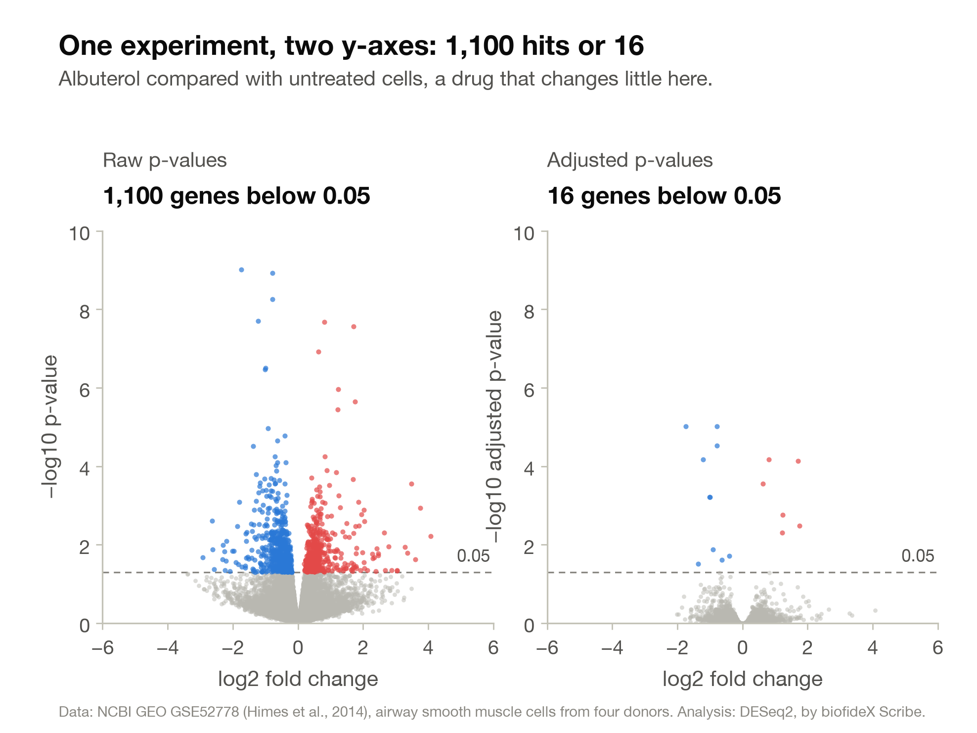
Some of the 1,100 are surely real. But a raw p-value cannot say which, because about a thousand genes would have cleared the same bar by luck.
The fix: control the false discovery rate
There are two classic repairs.
The Bonferroni correction makes it unlikely that even one false positive slips through. It divides the cut-off by the number of tests: 0.05 ÷ 20,000 = 0.0000025. That is very strict, and in a gene expression experiment it throws away many real findings.
The Benjamini-Hochberg procedure takes a different view. It accepts that a few false positives will get through, and controls what share of the list they make up. That share is the false discovery rate, or FDR. This procedure is the default in DESeq2, edgeR and limma, and almost every volcano plot you meet relies on it.
Its output is an adjusted p-value for each gene, which reads like this:
If you call significant every gene with an adjusted p-value below 0.05, then on average no more than about 5% of the genes on your list are false discoveries.
That is a statement about the list, not about any single gene. Our dexamethasone list has 4,804 genes with an adjusted p-value below 0.05. Up to about 240 of them are expected to be false, and nothing in the data says which ones.
A worked example with ten genes
The procedure is simple enough to do by hand. Take ten genes and sort them by p-value.
rank  gene   raw p    raw p x 10 / rank   adjusted p
  1    A     0.001         0.010            0.010
  2    B     0.004         0.020            0.020
  3    C     0.012         0.040            0.0375
  4    D     0.015         0.0375           0.0375
  5    E     0.031         0.062            0.062
  6    F     0.045         0.075            0.075
  7    G     0.20          0.286            0.286
  8    H     0.44          0.550            0.550
  9    I     0.62          0.689            0.689
10 J 0.91 0.910 0.910- Sort the p-values from smallest to largest and number them.
- Multiply each p-value by the number of tests (10 here) and divide by its rank.
- Working up from the bottom of the list, never let a value be larger than the one below it. That is why gene C takes 0.0375 from gene D.
With a raw p-value below 0.05, six genes pass (A to F). With an adjusted p-value below 0.05, four pass (A to D). Gene F, with a raw p-value of 0.045, ends at 0.075 and drops out.
The top-ranked gene is multiplied by the full number of tests, exactly as Bonferroni would do. Each gene further down the list is penalised a little less.
The adjustment adapts to the experiment
There is no fixed exchange rate between raw and adjusted p-values. In our two comparisons, an adjusted p-value of 0.05 corresponded to:
- a raw p-value of about 0.013 for dexamethasone, where thousands of genes respond
- a raw p-value of about 0.00003 for albuterol, where few do
When many genes truly change, the procedure can afford to be lenient. When few do, it is strict. A raw p-value of 0.001 was comfortably significant in one comparison and not significant in the other, in the same cells and on the same sequencer.
Names you will meet
padj (DESeq2), FDR (edgeR), adj.P.Val (limma), q-value and "BH-adjusted p-value" are, in everyday use, the same kind of number. Strictly, a q-value comes from a closely related method, and it is read the same way.
How to tell which p-value is on the axis
- Read the axis label. "−log10(p)" or "−log10(p-value)" should mean raw. "padj", "FDR", "q" or "adjusted" means adjusted.
- Look for flat shelves. Step 3 of the recipe creates ties, as it did for genes C and D. On an adjusted axis, tied genes sit at exactly the same height and form level rows. The two highest blue dots in the right-hand panel of Figure 3 are one such pair.
- Check how the colours were assigned. Both common designs are fine: raw p-values on the axis with colours taken from adjusted ones, as in Figure 1, or adjusted p-values on the axis itself.
Six ways a volcano plot can mislead you
A volcano plot can be drawn correctly and still leave a false impression. These six patterns are worth checking every time.
1. A raw p-value line passed off as significance
This was covered above and is common enough to repeat. If the horizontal line sits at a raw p-value of 0.05, the coloured dots include about a thousand genes that chance alone would put there. Look for the word "adjusted".
2. The loud corners
The dots furthest left and right at the bottom of the plot look dramatic. Most of them are genes with almost no reads.
Take OCA2 in our data. Its read counts in the four untreated samples were 0, 0, 0 and 0. In the four treated samples they were 0, 6, 0 and 7. The software reports a rise of more than sixfold, with a p-value of 0.34. Thirteen reads in two samples out of four is not a finding.
Low-count genes fill the corners because small numbers produce wild ratios. Going from 1 read to 8 is an eightfold change, and so is going from 1,000 to 8,000. Only the second is evidence.
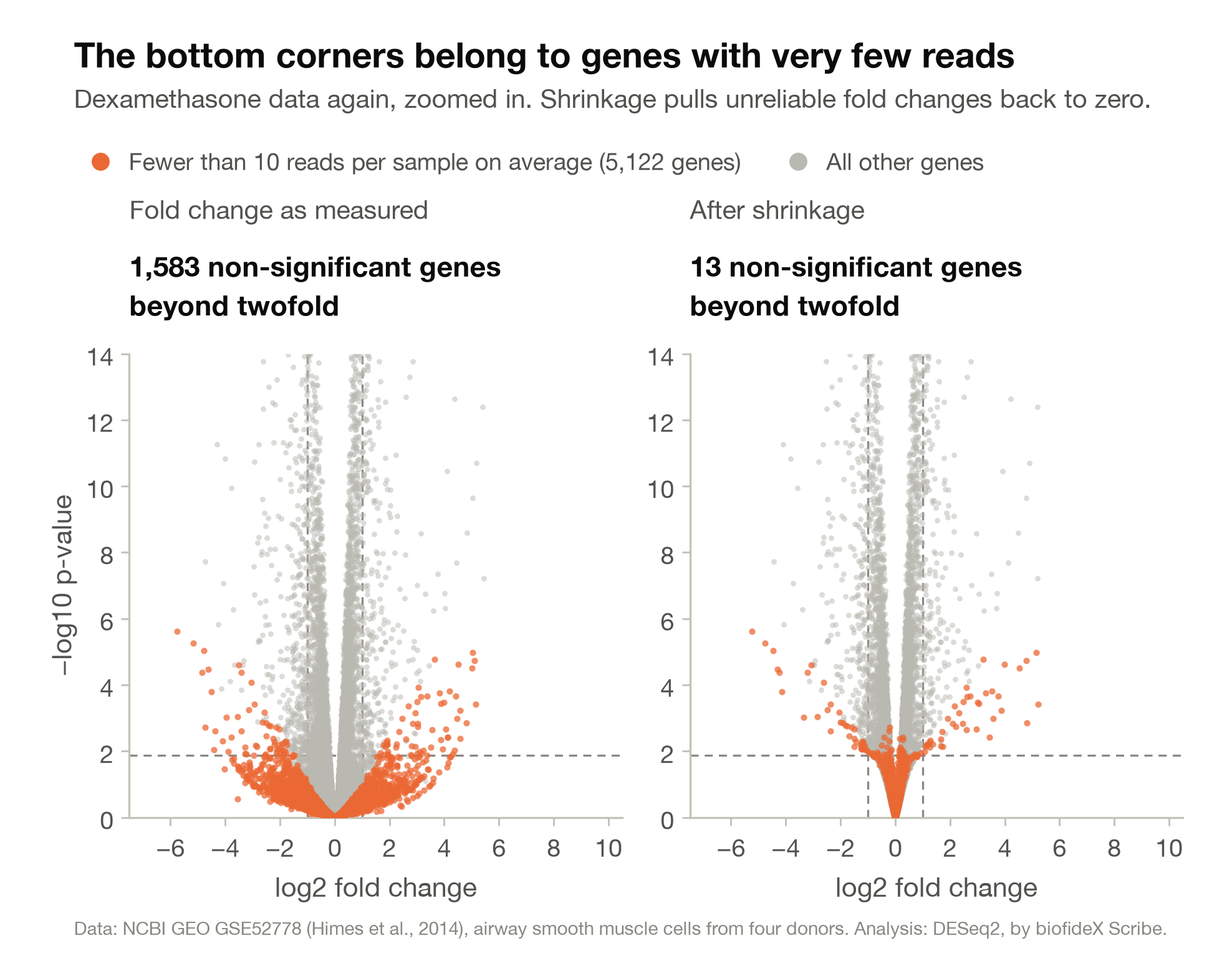
In our dataset, 1,583 genes sit beyond the twofold lines without reaching significance. Of those, 1,451 (92%) average fewer than 10 reads per sample.
Analysts handle this in two ways, and each changes how the plot looks:
- Shrinkage. Methods such as apeglm pull each fold change towards zero in proportion to how unreliable it is. Well-measured genes barely move, and the noisy corners collapse. The right-hand panel of Figure 4 shows the result.
- Filtering. Low-count genes are removed before testing, or the software declines to give them an adjusted p-value. DESeq2 set aside 3,810 of our genes this way.
So the same data can produce a wide, ragged volcano or a narrow, tidy one. Neither is dishonest, but the methods should say which one you are looking at.
A corner is not always noise. FPR1 went from 0, 0, 1 and 0 reads to 4, 16, 12 and 5. All four donors agree, and the change may well be real, but with so few reads the software declined to judge it. "Unproven" is the right word for the corners, not "false".
3. Too few replicates, or the wrong kind
The height of every dot depends on how many independent samples stand behind it, and the plot does not show that number.
We re-ran the dexamethasone analysis with cells from two donors instead of four. Same cells, same drug, same software:
- four donors: 4,804 genes with an adjusted p-value below 0.05
- two donors: 1,646 genes
About two thirds of the significant genes vanished, and the biology had not changed. A sparse volcano may mean a weak treatment, or simply a small experiment.
The opposite error is worse. In single-cell experiments it is tempting to treat every cell as a replicate. Ten thousand cells from three mice then pass for ten thousand independent samples, and the p-values shrink to absurd sizes. They are still three mice. The replicate is the animal, the donor or the culture, never the cell.
Check too that the groups differ only in the treatment. If every treated sample was prepared on Monday and every control on Friday, the plot shows the drug plus the day and cannot separate them.
4. Hand-picked labels
The gene names on a volcano plot are chosen by its author. Sometimes there is a stated rule, such as the ten smallest p-values. Often they are the genes that fit the paper's story.
Labels pull the eye, so an unlabelled dot at the same height reads as less important, though the data say nothing of the kind. In Figure 1 we named nine of the 1,157 coloured genes, picked because they are well known or sit at the extremes. Another author could tell a different story with the same dots.
5. A lopsided or off-centre shape
Most volcano plots are roughly balanced. Ours has 584 genes up and 573 down. That balance is partly built in, because the standard normalisation methods assume that most genes do not change.
A plot that leans heavily to one side, or whose grey mound is centred away from zero, has two possible explanations. The biology may really be one-sided. Or a technical difference between the groups, such as RNA quality or sequencing depth, has leaked through. A careful paper will say which.
There is a reverse trap as well. If a treatment shifts almost every gene in the same direction, normalisation will quietly re-centre the data and hide the shift behind a perfectly ordinary-looking plot.
6. What you cannot see
- Filtered genes. Our count file listed 39,376 genes. We removed 17,543 with fewer than 10 reads in total before testing. "Not on the plot" does not mean "did not change".
- Genes without an adjusted p-value. On a plot with adjusted p-values on the axis, the 3,810 genes that were set aside would not appear at all.
- Clipped axes. Figure 2 stops at a height of 14 to make the lower regions readable, and says so. A plot that trims its axis without saying so can hide its most extreme genes.
- Overlapping dots. Our grey mound is 15,446 dots drawn on top of one another. The 1,157 coloured ones get far more ink per gene.
Make one yourself
The best way to learn to trust, and to doubt, a volcano plot is to draw one. The steps below rebuild Figure 1 from the public data in about forty lines, in R or in Python.
If you already have a results table from any differential expression tool, skip to step 4 of either script. The plot needs only three numbers per gene: a log2 fold change, a p-value and an adjusted p-value.
Get the data
The experiment is public at NCBI's Gene Expression Omnibus under accession GSE52778. NCBI provides a ready-made table of read counts for it. Download GSE52778_raw_counts_GRCh38.p13_NCBI.tsv.gz and save it in a new folder, next to your script.
The table has one row per gene and one column per sample. Each cell is the number of sequencing reads assigned to that gene in that sample. There are 16 samples, and we use eight of them: untreated and dexamethasone-treated cells from each of four donors.
In R
Install the packages once:
install.packages(c("BiocManager", "ggplot2"))
BiocManager::install("DESeq2")
Then run:
library(DESeq2)
library(ggplot2)

# 1. Read the counts: one row per gene, one column per sample
counts <- read.delim("GSE52778_raw_counts_GRCh38.p13_NCBI.tsv.gz", row.names = 1, check.names = FALSE)

# 2. Describe the eight samples: four donors, each untreated and treated
samples <- data.frame(
  donor = factor(rep(c("N61311", "N052611", "N080611", "N061011"), each = 2)),
  treatment = factor(rep(c("untreated", "dex"), times = 4), levels = c("untreated", "dex")),
  row.names = c("GSM1275862", "GSM1275863", "GSM1275866", "GSM1275867",
                "GSM1275870", "GSM1275871", "GSM1275874", "GSM1275875")
)
counts <- counts[, rownames(samples)]
counts <- counts[rowSums(counts) >= 10, ]  # drop genes with almost no reads

# 3. Test every gene: treated against untreated, within each donor
dds <- DESeqDataSetFromMatrix(as.matrix(counts), samples, design = ~ donor + treatment)
dds <- DESeq(dds)
res <- as.data.frame(results(dds, contrast = c("treatment", "dex", "untreated")))
write.csv(res, "dex_vs_untreated.csv")

# 4. Draw the plot
hit <- !is.na(res$padj) & res$padj < 0.05 & abs(res$log2FoldChange) > 1
res$group <- ifelse(hit & res$log2FoldChange > 0, "higher", ifelse(hit, "lower", "not a hit"))

ggplot(res, aes(log2FoldChange, -log10(pvalue), colour = group)) +
  geom_point(size = 0.8) +
  geom_vline(xintercept = c(-1, 1), linetype = "dashed", colour = "grey40") +
  scale_colour_manual(values = c(higher = "firebrick", lower = "royalblue", "not a hit" = "grey80")) +
  labs(x = "log2 fold change (dexamethasone / untreated)", y = "-log10 p-value", colour = NULL,
       title = paste(sum(hit), "genes: adjusted p < 0.05 and more than twofold")) +
  theme_classic()
ggsave("volcano.png", width = 7, height = 6, dpi = 200)
The design ~ donor + treatment tells DESeq2 that each donor supplied one treated and one untreated sample, so each gene is compared within donors. The contrast names the direction: dex divided by untreated.
In Python
Install the packages once:
pip install pandas matplotlib "pydeseq2>=0.5"Then run:
import numpy as np
import pandas as pd
import matplotlib.pyplot as plt
from pydeseq2.dds import DeseqDataSet
from pydeseq2.ds import DeseqStats

# 1. Read the counts: one row per gene, one column per sample
counts = pd.read_csv("GSE52778_raw_counts_GRCh38.p13_NCBI.tsv.gz", sep="\t", index_col="GeneID")

# 2. Describe the eight samples: four donors, each untreated and treated
samples = pd.DataFrame(
    {
        "donor": ["N61311", "N61311", "N052611", "N052611", "N080611", "N080611", "N061011", "N061011"],
        "treatment": ["untreated", "dex"] * 4,
    },
    index=["GSM1275862", "GSM1275863", "GSM1275866", "GSM1275867",
           "GSM1275870", "GSM1275871", "GSM1275874", "GSM1275875"],
)
counts = counts[samples.index]
counts = counts[counts.sum(axis=1) >= 10]  # drop genes with almost no reads

# 3. Test every gene: treated against untreated, within each donor
dds = DeseqDataSet(counts=counts.T, metadata=samples, design="~donor + treatment")
dds.deseq2()
stats = DeseqStats(dds, contrast=["treatment", "dex", "untreated"])
stats.summary()
res = stats.results_df  # one row per gene: log2FoldChange, pvalue, padj and more
res.to_csv("dex_vs_untreated.csv")

# 4. Draw the plot
zero = res["pvalue"] == 0
print(zero.sum(), "gene(s) with a p-value of exactly 0 cannot be drawn on a log axis")
res = res[~zero]

x = res["log2FoldChange"]
y = -np.log10(res["pvalue"])
hit = (res["padj"] < 0.05) & (x.abs() > 1)
colour = np.where(hit & (x > 0), "firebrick", np.where(hit, "royalblue", "lightgrey"))

fig, ax = plt.subplots(figsize=(7, 6))
ax.scatter(x, y, c=colour, s=6, linewidths=0)
ax.axvline(-1, color="grey", linestyle="--", linewidth=0.8)
ax.axvline(1, color="grey", linestyle="--", linewidth=0.8)
ax.set_xlabel("log2 fold change (dexamethasone / untreated)")
ax.set_ylabel("-log10 p-value")
ax.set_title(f"{hit.sum():,} genes: adjusted p < 0.05 and more than twofold")
fig.savefig("volcano.png", dpi=200)
What you should see
Both scripts were run before publication, with R 4.5.3 and DESeq2 1.50.2, and with Python 3.12 and PyDESeq2 0.5.4.
- R tests 21,833 genes and reports 1,157 hits, the numbers used throughout this article.
- Python tests the same 21,833 genes and reports 1,173 hits. It also prints that one gene has a p-value of exactly zero. That gene is CDV3, the one discussed above.
The two lists share 1,149 genes. The small disagreement is a lesson in itself: a hit list depends on the software as well as on the cut-offs.
Three experiments worth five minutes each
- Move the fold-change line from 1 to 0.58, then to 2, and watch the hit count change.
- Put the adjusted p-value on the y-axis instead of the raw one (
padjin place ofpvalue) and look for the level rows of tied genes. - Keep only the first four samples, which are two donors, and run the analysis again.
A checklist for any volcano plot
Before you believe a volcano plot, in a paper or in your own analysis, put these ten questions to it.
- What is being compared, and which direction is positive? Look for "A versus B" in the axis label or the caption.
- Is the height a raw or an adjusted p-value? And which of the two decides the colours?
- Where are the cut-offs, and does the paper say why?
- How many genes were tested, and how many pass? The coloured dots are usually a few per cent of the total.
- How many independent replicates stand behind each group? Count donors, animals or cultures, not cells or repeat runs of one sample.
- Did the groups differ in anything besides the treatment? Think of batch, processing day and operator.
- Are the fold changes raw or shrunken, and were low-count genes filtered out?
- Is the cloud centred on zero and roughly balanced? If not, is there an explanation?
- By what rule were the labelled genes chosen?
- Is anything cut off or left out? Check the axis limits, genes with a p-value of zero, and genes removed before testing.
One last check needs biology and not statistics: do the top hits include the genes you would expect? In our data the steroid-response genes were there, which is why we trusted the rest.
What to take away
A volcano plot is thousands of small claims drawn at once, and each dot's position says how big the claim is and how well it is supported.
- Left and right is "how much". Each unit of log2 fold change is one doubling or one halving.
- Up and down is "how sure". Each unit of height makes the p-value ten times smaller, and above ten or so the height is only a ranking.
- High and wide is the goal. High and central means small but reliable. Low and wide means large but unproven.
- The lines are choices. The same experiment gave us between 274 and 2,543 hits, depending on where they were drawn.
- "Adjusted" is the word to look for. Without it, a 20,000-gene experiment hands you about a thousand hits made of chance.
- The plot hides its own foundations. Replicate numbers, read depth, filtering and the choice of software all live in the methods section, so read that too.
None of this makes the volcano plot a poor figure. It became standard because it shows the size of an effect and the evidence for it in one view, which a list of gene names cannot do. It simply rewards a reader who knows where to look.
The next time one appears on a slide in lab meeting, start with the first question on the checklist: what was compared with what?
Sources and methods
How the numbers were produced
Every count and figure here comes from the NCBI-generated read count table for GEO accession GSE52778, using the untreated, dexamethasone and albuterol samples from all four donors.
Genes with fewer than 10 reads in total across the samples in a comparison were removed. Each comparison was tested with DESeq2 1.50.2 in R 4.5.3, using the design donor + treatment, the Wald test, and the Benjamini-Hochberg adjustment with DESeq2's default filtering. Shrunken fold changes come from apeglm 1.32.0. The Python comparison used PyDESeq2 0.5.4. The analysis was run in October 2026.
Further reading
The experiment. Himes BE and colleagues (2014). RNA-Seq transcriptome profiling identifies CRISPLD2 as a glucocorticoid responsive gene that modulates cytokine function in airway smooth muscle cells. PLoS ONE 9(6): e99625.
The false discovery rate. Benjamini Y, Hochberg Y (1995). Controlling the false discovery rate: a practical and powerful approach to multiple testing. Journal of the Royal Statistical Society Series B 57(1): 289-300.
The method behind most RNA-seq volcano plots. Love MI, Huber W, Anders S (2014). Moderated estimation of fold change and dispersion for RNA-seq data with DESeq2. Genome Biology 15: 550.
Fold-change shrinkage. Zhu A, Ibrahim JG, Love MI (2019). Heavy-tailed prior distributions for sequence count data: removing the noise and preserving large differences. Bioinformatics 35(12): 2084-2092.
The Python implementation. Muzellec B, Teleńczuk M, Cabeli V, Andreux M (2023). PyDESeq2: a python package for bulk RNA-seq differential expression analysis. Bioinformatics 39(9): btad547.
Cells are not replicates. Squair JW and colleagues (2021). Confronting false discoveries in single-cell differential expression. Nature Communications 12: 5692.
What a p-value is and is not. Wasserstein RL, Lazar NA (2016). The ASA statement on p-values: context, process, and purpose. The American Statistician 70(2): 129-133.
Reactions
From QuizLab
Test Your Knowledge
Quizzes on the same ground as this article. Pick one and see how much stuck.
- BioinformaticsBeginnerIntro to Bioinformatics9questionsStart Quiz
- BioinformaticsIntermediateSequence Alignment14questionsStart Quiz
- BioinformaticsAdvancedPhylogenetic Tree Construction13questionsStart Quiz
- BioinformaticsAdvancedNext-Generation Sequencing (NGS)13questionsStart Quiz
- BioinformaticsBeginnerBiological Databases10questionsStart Quiz
- BioinformaticsBeginnerIntroduction to Sequence Alignment10questionsStart Quiz
Keep Reading
More from Scribe
Articles on related ground, and the newest from Scribe.
 Bioinformatics
FASTA, FASTQ, BAM and VCF: Bioinformatics File Formats Explained
A beginner's guide to the files every genomics project runs on. Follow one real coronavirus sample from FASTQ to BAM to VCF, decode quality scores, SAM flags and CIGAR strings, and avoid the off-by-one error that can hide a mutation.
biofideXOctober 14, 202640 min read Research Insights
AlphaFold 3 to IsoDDE: How AI Drug Discovery Got Twice as Accurate in 18 Months
DeepMind's AlphaFold 3 reshaped structural biology in 2024. By mid-2026, Isomorphic Labs' IsoDDE has more than doubled accuracy on the hardest protein-ligand systems.
biofideX5 min read Career Guidance
What Can You Do With a Biology Degree? Career Paths and the Skills Each One Needs
Choose the work, not the job title. A practical guide to biology careers: a typical day, the way in and the first skill for each path, which need a PhD, real UK graduate data, and how to test a path in a month.
biofideXOctober 14, 202626 min read Evolutionary Biology
How to Read a Phylogenetic Tree: A Step-by-Step Guide With Practice Trees
Learn to read any evolutionary tree with one simple rule. Built from real primate DNA, this beginner's guide covers clades, rotations, branch lengths, bootstrap values and roots, with eight practice trees and worked answers.
biofideXOctober 14, 202629 min read